4 Gipper Graphics We Loved This Week: An Alumni Game Announcement & Season Schedule Drop

We're sharing our favorite Gipper graphics that we saw this week! Check out the amazing sports graphics that admins just like you are creating with Gipper (then try recreating them yourself)!
Ardrey Kell Sports: Getting Fans Ready for 2023 Volleyball
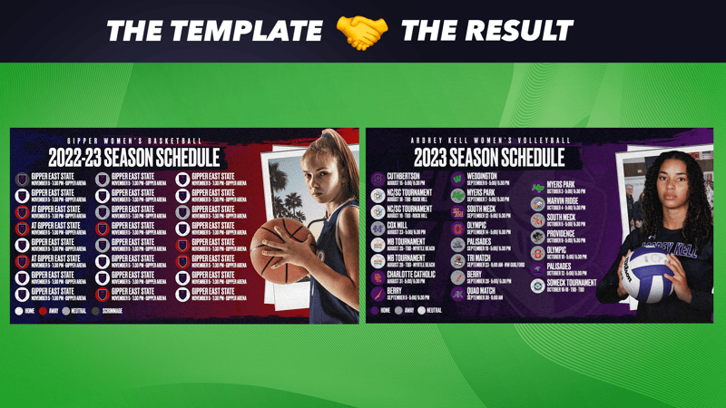
Why we love this graphic: Ardrey Kell really stuck to the template here, but with their branding and awesome cutout, this became a scroll-stopping graphic. Plus, this is a prime example of what equity in your athletic department looks like: Give all of your teams (not just football, basketball, or the ones that bring in ticket sales) the same treatment.
Just under 50 days until Women's Volleyball is back on the court for regular season action!
— Ardrey Kell Sports (@AKSportsInfo) June 28, 2023
Do you have your season pass? Grab yours now for entry to ALL home events including this Volleyball home package!https://t.co/SiVPwN4D9w pic.twitter.com/ZFVLn0ZmqS
How they made it: Watch and learn! Once you get the hang of it, this season schedule template can be made in minutes.
Fr. Gabriel Richard: Getting the Alumni Out to Play

Why we love this graphic: How's this for a fun alumni engagement tactic? Fr. Gabriel Richard is hosting its first-ever alumni lacrosse game and they're getting the word out on social. This type of event is perfect for summertime; it keeps current athletes active in the offseason, drives alumni back on campus, and reunites old teammates. Promoting this on social is the best way to reach as many alumni as possible, from the ones who have newly graduated to the ones who might be parents themselves now.
Plus, think about the awesome social content that's going to result from this event — score updates, alumni & current athlete spotlights, and probably an epic final score post. I'll be keeping my eyes peeled for more content from FGR (my bet is on the alumni)!
Calling all FGR alumni boys lacrosse players! We are hosting our first annual FGR alumni vs FGR Lax reunited game! We will host the current FGR varsity lacrosse team vs any and all FGR lacrosse alumni! Sign up on the signup genius link below. pic.twitter.com/WB6kvV6Y41
— Fr. Gabriel Richard (@FGRathletics) June 26, 2023
How they made it: If you have no idea which template FGR used for this graphic, you're not alone. It wasn't until I did a search of all of Gipper's announcement templates that I finally found the one they used: a parent-teacher conference template!
- Upload a great team celebration picture in the Media field.
- Swap out your logo!
- Change the Secondary color to one of your colors. No need to touch the Main color (white) if you don't want to!
- Input your text! You might have to adjust the size of the text box to get a good fit — you can do that by clicking directly on the canvas and using the toggles to expand the box.
Pro Tip: FGR added an additional text box to include the signup link on the graphic. We recommend adding this directly to your caption instead so that your followers can click the link!
OIAAA: Highlighting Newly Certified ADs
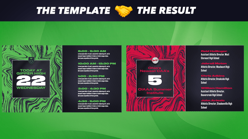
Why we love this graphic: Gipper partners with a ton of athletic associations across the nation, and not only do they help bring Gipper to their member schools, but they also use the platform for their own social media needs. And that means highlighting the incredible accomplishments of their ADs. Kudos to the OIAAA for celebrating five of their admins who have already passed the CAA exam this summer!
Not sure if your association is partnered with Gipper? Ask us! Partner association members get access to exclusive Gipper pricing!
This graphic is also a great example of how every single template can be used for ANYTHING by making a few small tweaks. OIAAA turned a daily schedule template into something completely different just by updating the text.
Congratulations to the 5 Athletic Administrators who passed their CAA exam at the Summer Institute. @NIAAA9100 pic.twitter.com/3XBq093io8
— OIAAA (@ohioiaaa) June 26, 2023
How they made it: Get started with a tried & true classic: the daily schedule template in Wave.
- Upload your logo.
- Change the Main color to one of your organization's colors. Save some time by keeping the Secondary and Tertiary colors the same!
- Edit your text as needed! OIAAA changed the time and description fields to showcase their admins' names, titles, and locations.
Green Hope Athletics: Gipper Graphics Beyond Social

Why we love this graphic: As always, we love to see organizations welcome new coaches and staff members on social media. It's a great way to give your community visibility into who's joining your team, but it also enables your entire community to give them a warm welcome!
The true beauty of this graphic, though, is where it lives. You might think it's a normal image in a normal Tweet, but look closer:
New Story: Justin Reitz Named Head Baseball Coach https://t.co/pLrGtrb6Fs
— Green Hope Athletics (@GHHSSports) June 26, 2023
This graphic is actually the featured image of an article on Green Hope's website. We LOVE when our customer's use our graphics for things other than social media. This use case in particular is a great one, because it entices followers to click the link back to your organization's website. From there, they can learn a ton about you and explore more of what you have to offer (like season tickets, tryout information, camp registration, and much more)!
How they made it: There's nothing too fancy going on here! Stick to our new hire welcome template in Grunge.
- Upload a photo of your new hire!
- Swap out your logo.
- Adjust your organization's colors.
- Adjust your text!
- Green Hope added in an Under Armour logo — if your school has a partnership or sponsorship deal, make sure to include that too!
OTHER RESOURCES YOU MIGHT LIKE






.png)